

At first glance, there is a certain stillness to this four-room BTO at Tengah Garden.
Warm neutral tones move throughout the home, large surfaces are kept relatively uninterrupted, and decorative elements are deliberately restrained.
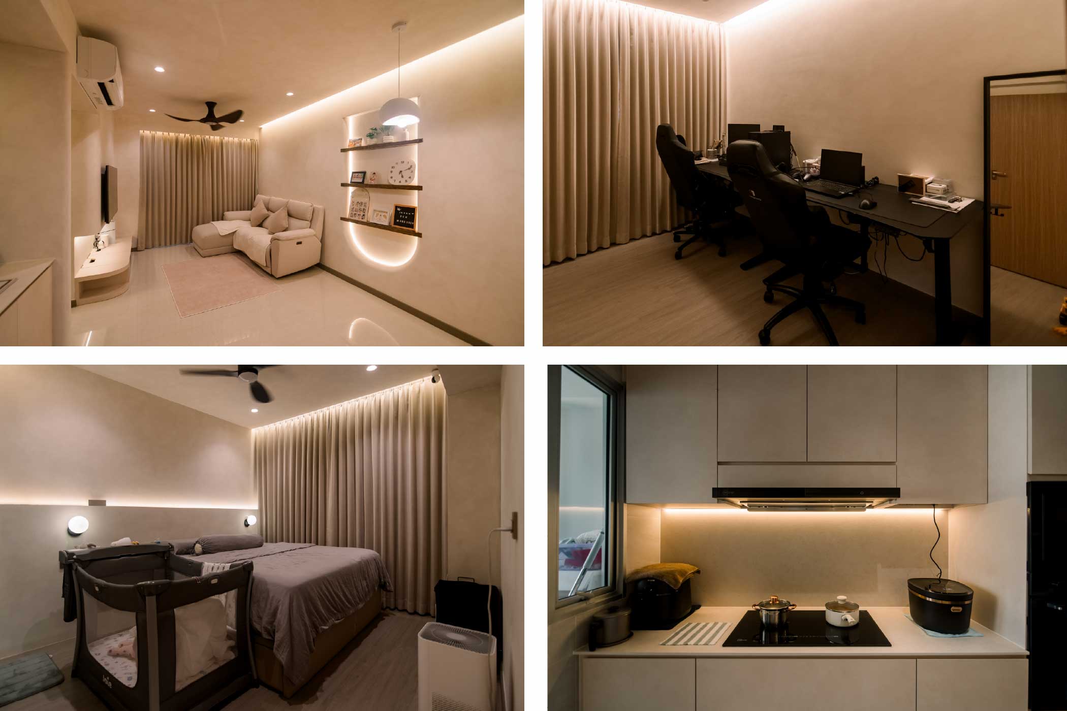
Look more closely, however, and this is far from an empty minimalist interior. Full-height storage occupies the entrance. The kitchen contains extensive cabinetry and integrated appliances. Display shelves accommodate photographs and personal objects, concealed lighting appears throughout the living spaces and bedroom, and one room has been dedicated to a substantial two-person workspace.
These practical requirements were part of the homeowners’ brief from the beginning. As a young family, they wanted a home that would be easy to maintain, family and child-friendly, bright and comfortable for everyday living.
Rather than removing practical elements to achieve a cleaner aesthetic, Project Focal’s approach was to integrate them into the architecture of the home.
The designers describe the central idea simply as creating “a clean, seamless flow throughout the space.”
That idea becomes clearer when the home is viewed as a whole. Instead of relying on one statement feature, its identity develops through repeated relationships between cabinetry, lighting, materials, curves and colour.
Project Snapshot
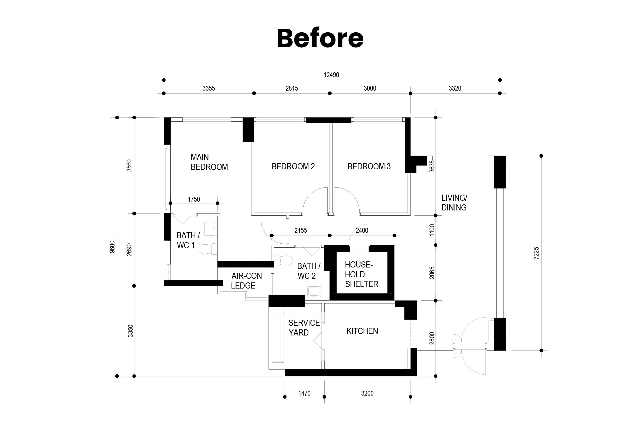
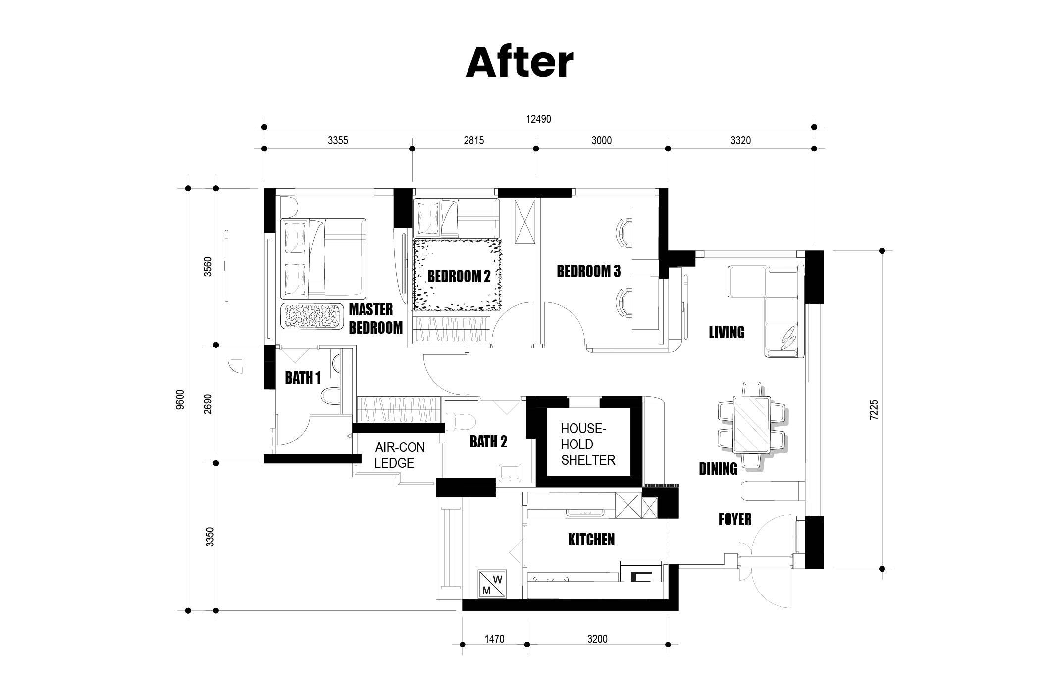
Project: Tengah Garden
Property Type: HDB BTO
Unit Type: 4-Room
Size: 95 sqm
Design Style: Wabi-Sabi
Renovation Budget: Approximately S$33,000*
Interior Designer: Project Focal
Completion Year: 2025
*The renovation value reflects the specific scope of works, material selections and requirements of this project and should not be treated as a standard package price or benchmark for every 4-room BTO renovation.
Designing the Home as One Composition
One of the home’s strongest qualities is something that may not be immediately obvious: very little feels visually disconnected from everything around it.
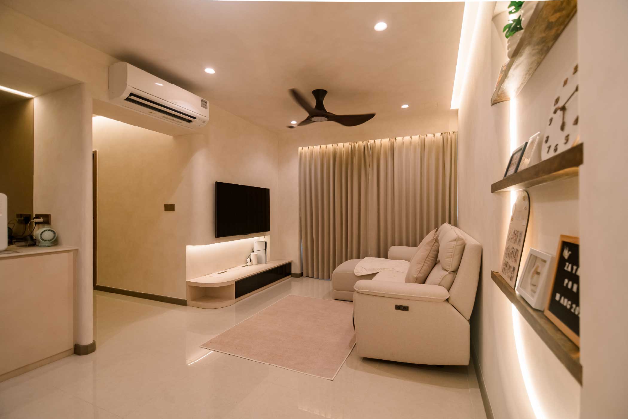
Warm neutral tones continue across the walls and ceiling, while the cabinetry remains within a similar tonal family. Against this softer backdrop, contrast is introduced selectively: a black ceiling fan anchors the living room overhead, darker shelving provides definition along the display wall, while black appliances introduce stronger accents within the kitchen.
Rather than treating every room or zone as an opportunity for a different decorative feature, Project Focal carries the same visual language throughout the home.
In a relatively compact BTO, too many abrupt changes in colour, material or carpentry can visually divide an interior. Here, consistency allows the different spaces to remain connected even as their functions change.
This is also where Project Focal’s emphasis on space planning and material selection becomes apparent. The materials are not competing to become individual features. Instead, they create a consistent backdrop against which everyday family life can take place.
The result is less about perfect uniformity than visual control. There are differences in tone, texture and function, but relatively few abrupt transitions to interrupt the composition.
Softening the Edges
Look beyond the colour palette and another detail begins to repeat throughout the interior: curves.
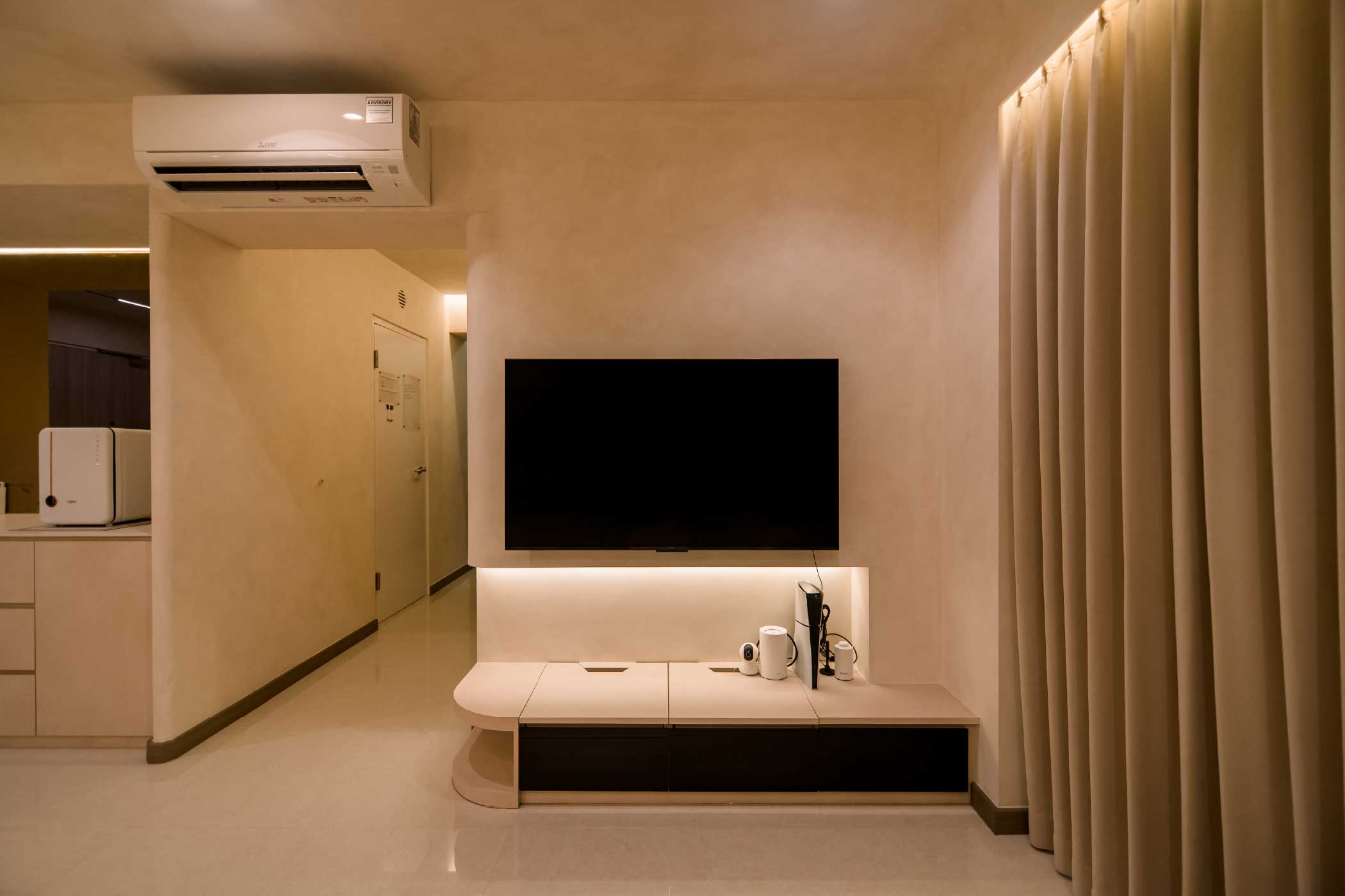
The television console, for instance, finishes with a rounded corner rather than a conventional square edge. The treatment around the television wall also transitions gently into the adjoining surface, breaking down what could otherwise have become a rigid rectangular composition.
These are relatively small gestures, but they serve an important purpose. Visually, the curves soften the long horizontal and vertical lines created by cabinetry, walls and lighting without turning themselves into overt decorative features.
They also reveal something about the difficulty of designing an interior intended to appear seamless.
“The seamless finishes looked simple, but getting every detail and alignment right was quite challenging.”
When an interior contains fewer decorative elements, there is also less available to disguise poor junctions or awkward alignments. Carpentry positions, lighting locations, curves, material transitions and the points where different surfaces meet have to be carefully coordinated.
The simpler the finished interior appears, the more visible inconsistencies can become.
Here, the detailing works precisely because it rarely asks to be noticed.
When Light Becomes Part of the Architecture
Lighting is one of the clearest design threads running through the project.
Rather than relying primarily on decorative light fittings, much of the lighting has been integrated directly into the interior.
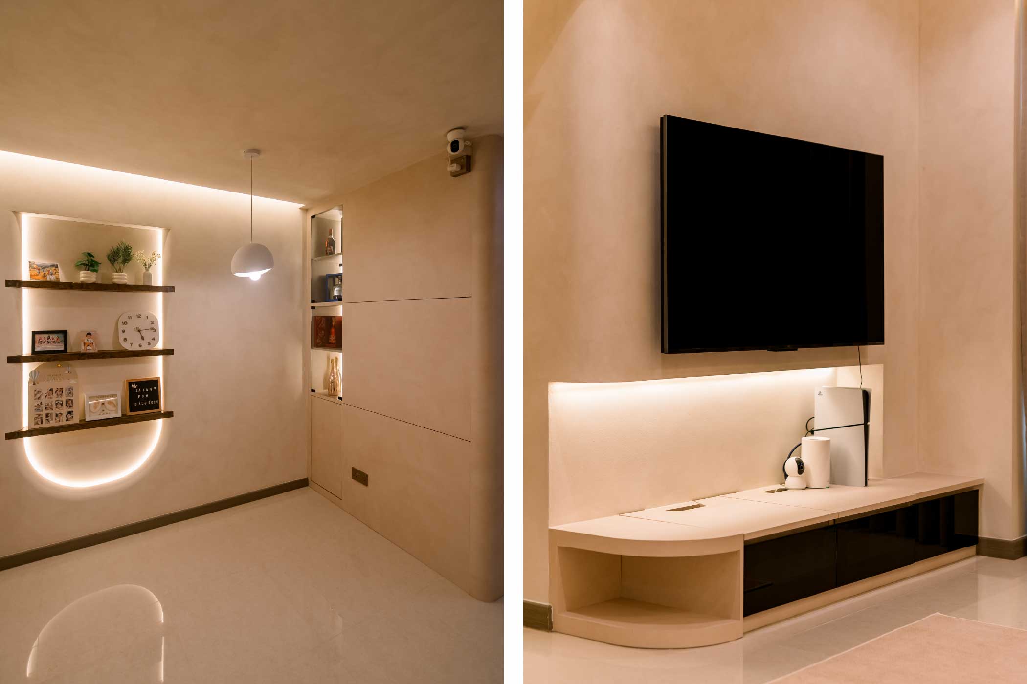
In the living room, a long-concealed strip washes warm light across the upper wall and ceiling. Beneath the television, another recessed source creates a softer pool of illumination, while the display wall uses integrated lighting to trace its niche and highlight the darker timber shelves.
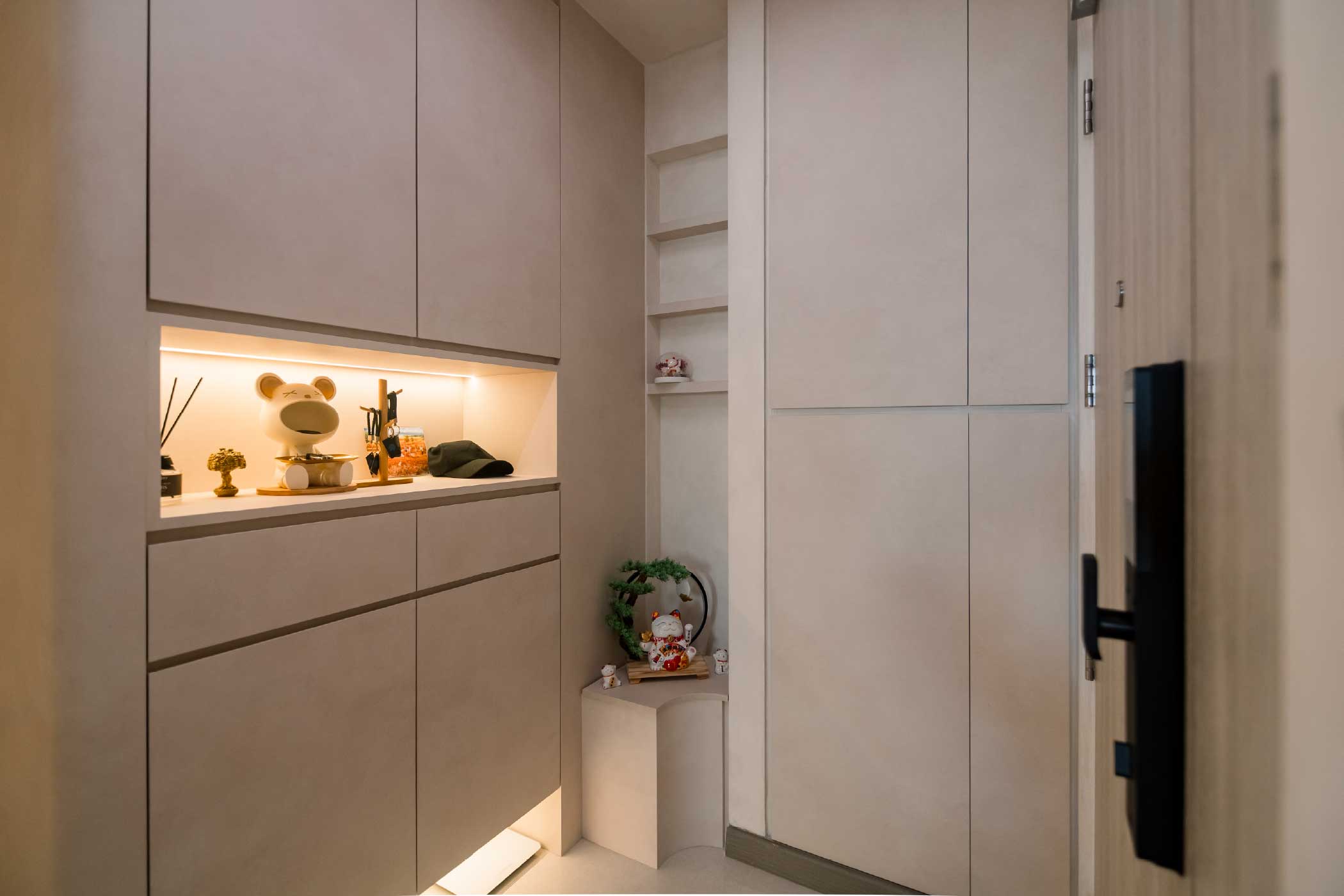
The same approach continues at the entrance. Lighting transforms an open niche within the full-height cabinetry into a practical landing area for smaller everyday belongings, while illumination beneath the lower cabinets visually lifts the larger storage volume away from the floor.
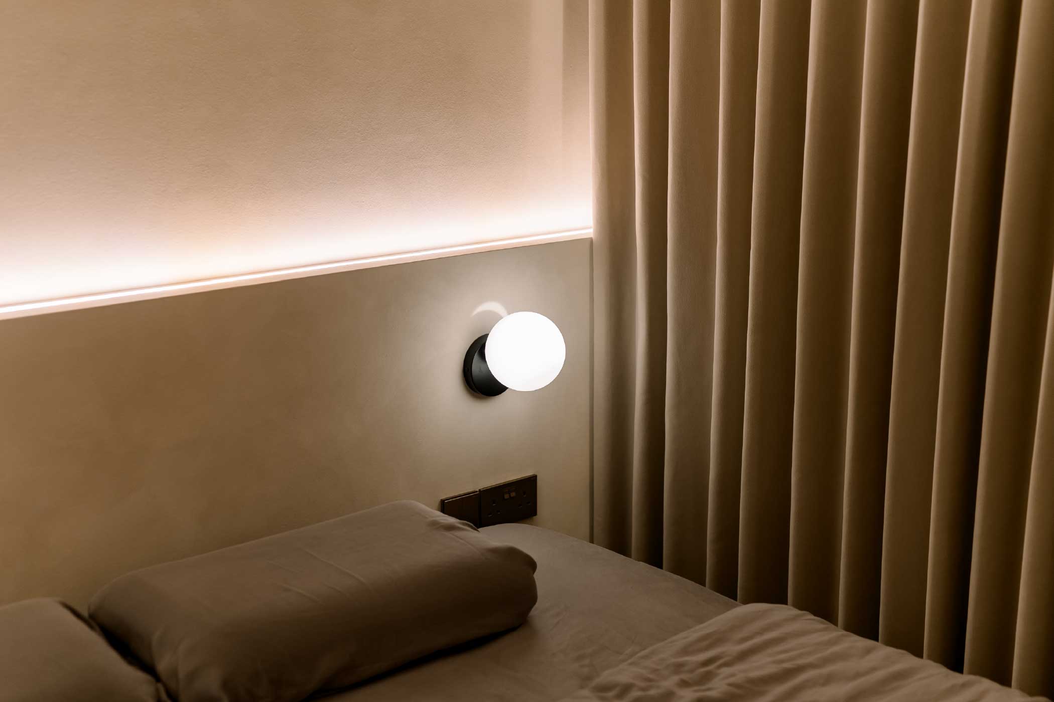
In the bedroom, the treatment becomes quieter still. A narrow line of concealed light follows the wall beside the bed, paired with a simple globe lamp rather than a more elaborate bedside feature.
The repetition is subtle but deliberate.
Lighting here is not something simply added after the interior has been designed. It forms part of the architecture itself, revealing surfaces, creating depth and defining edges without introducing unnecessary additional materials.
That is particularly effective in a home with such a restrained palette. Instead of adding another feature wall or decorative finish, light itself provides the variation.
Making Storage Part of the Background
A visually calm family home still needs somewhere to put things.
A young family does not suddenly need fewer shoes, bags, household supplies or everyday belongings simply because the design direction is minimalist.
Project Focal’s solution was therefore not to reduce storage, but to reduce its visual impact.
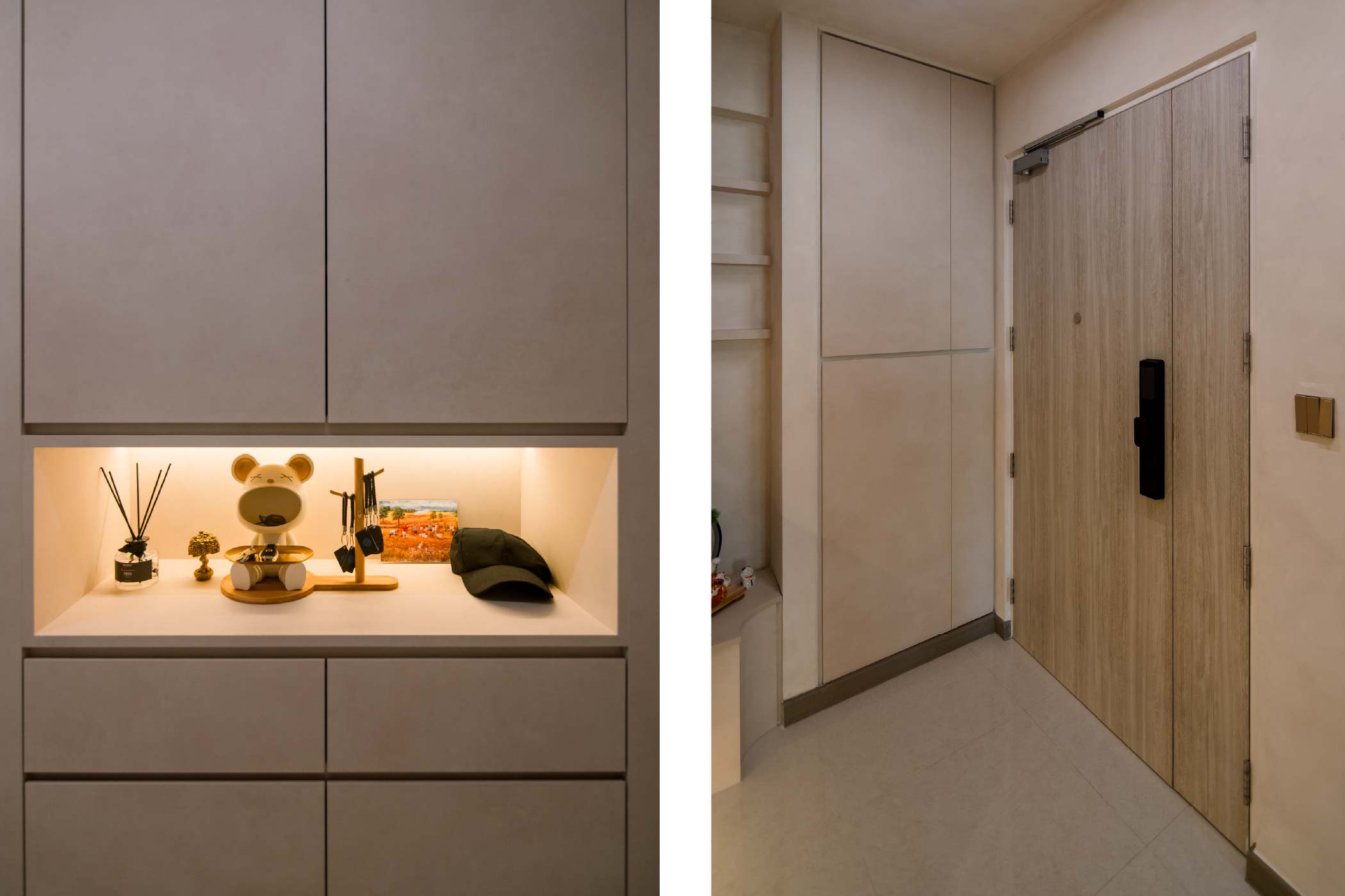
At the entrance, full-height cabinetry occupies a substantial portion of the available space. Rather than turning this into a dominant carpentry feature, the cabinet fronts remain close to the surrounding colour palette, allowing the larger volume to visually recede.
An illuminated niche interrupts the full-height cabinetry and provides a convenient landing point for everyday objects. Open shelving beside it makes use of a narrower section of wall while providing display space without introducing another freestanding piece of furniture.
The family gets the storage it needs, while the entrance retains the calmer character of the rest of the home.
The kitchen follows the same principle.
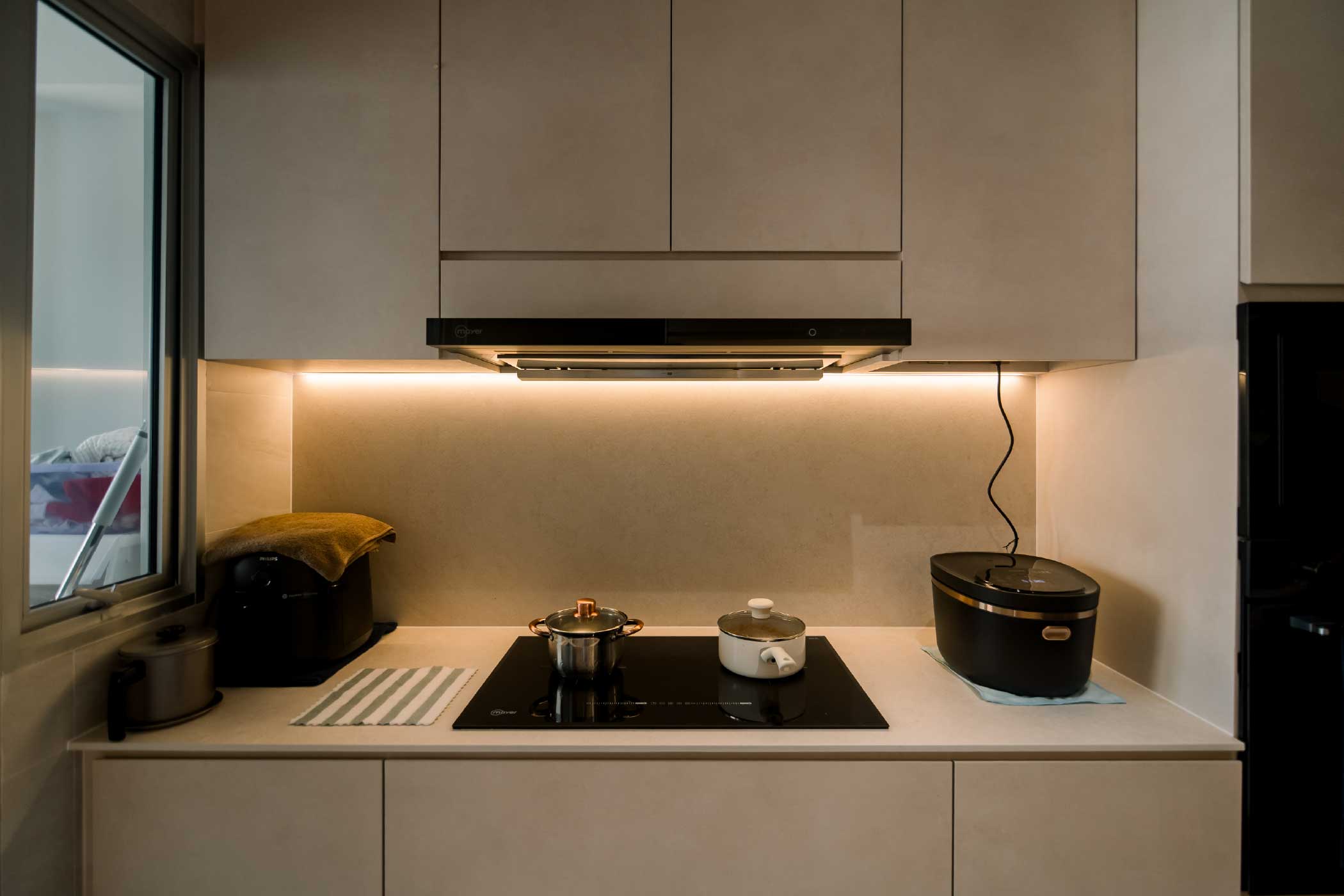
Upper and lower cabinetry make extensive use of the available wall space, while the cabinet fronts remain visually controlled. A recessed open shelf interrupts the upper cabinetry and keeps frequently used items within easy reach.
Black integrated appliances provide a stronger point of contrast, but storage itself is never asked to become the visual identity of the room.
For a compact family home, this distinction matters.
Visual simplicity does not necessarily come from having less to store. Sometimes it comes from designing better places for everyday life to happen.
Wabi-Sabi Without the Usual Signals
Project Focal describes the design direction as Wabi-Sabi, but the home deliberately avoids relying too heavily on the more recognisable styling cues associated with the aesthetic.
Instead, its influence appears primarily through atmosphere and materiality.
The walls and ceiling carry a softly mottled finish, while warm beige, stone and muted neutral tones establish the wider palette. Timber and darker accents are introduced selectively rather than layered throughout every room.
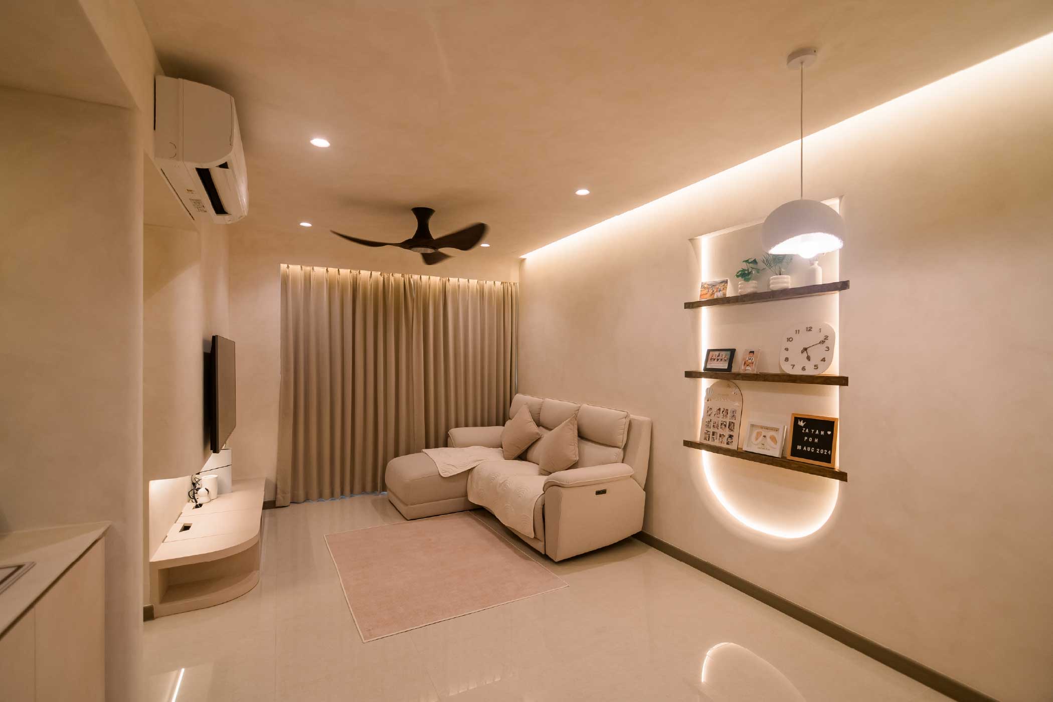
This allows the Wabi-Sabi influence to remain part of the atmosphere without turning the home into a collection of decorative objects.
It also reflects Project Focal’s wider approach: rather than starting with a design style and forcing the homeowner’s lifestyle into it, the design begins with how the space needs to function for the people living there.
The design language can then develop around those requirements.
Here, subtle variations in texture and tone provide enough character that the walls do not require elaborate panelling or artwork everywhere. Lighting and softened forms introduce another layer of variation, preventing the restrained palette from becoming flat or monotonous.
Designed Around Everyday Life
One of the most revealing rooms in the project may also be one of its least styled.
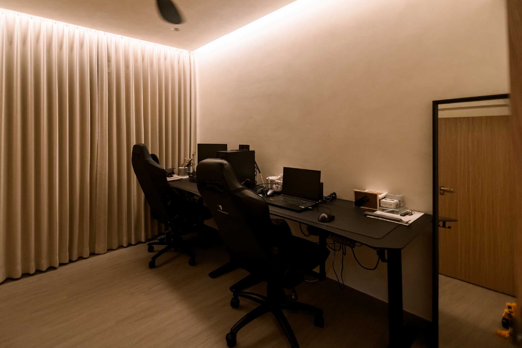
Away from the living room, an entire room has been configured as a substantial shared workspace, complete with multiple monitors, office chairs, equipment and the inevitable cables that come with them.
And that is precisely the point.
The home was never designed simply to look good in photographs.
The homeowners’ requirements had to coexist with working from home, storage, appliances, family belongings and the routines of everyday life.
Not every room therefore needs to make the same visual statement. The communal spaces carry the home’s stronger design language, while the workspace is allowed to remain more utilitarian because that is what the family needs from it.
A successful home should not require its occupants to change the way they live simply to preserve the design. Instead, the design should provide a framework that makes everyday life easier.
That balance is ultimately what makes the quieter areas of this Tengah home convincing. They are not calm because everyday life has been edited out of the picture. The design has simply established a clearer framework for it to take place within.
The Detail Is in the Continuity
Ask Project Focal what they are proudest of in this project and the answer is surprisingly simple: how the entire home came together.
There is no single feature responsible for its identity.
Instead, the project is built from a series of smaller decisions: where cabinetry meets a wall, where a straight line transitions into a curve, where concealed lighting reveals an architectural edge, where one warm surface continues into another, and where storage is allowed to disappear rather than demand attention.
The designers were equally deliberate about what they chose not to introduce.
“We deliberately avoided over-designing the space. We wanted to keep it clean and timeless, focusing on functionality and details that would still look good for years to come.”
That restraint does not mean there is little happening.
The entrance contains considerable storage. The kitchen is fully fitted. Lighting is integrated across multiple spaces. The living room accommodates both entertainment and display, while another room supports a substantial two-person work setup.
What changes is simply how loudly those elements announce themselves.
Project Focal summarises its wider approach with a straightforward belief:
“Good design is where functionality meets timeless beauty.”
About Project Focal
Project Focal is a Singapore interior design studio specialising in residential interiors across HDB flats, condominiums and landed homes.
Rather than beginning with a predetermined design style, the studio’s approach starts with the homeowner: how they use their space, what needs to be stored, how they move through the home and what they want everyday life to feel like.
From space planning and material selection to carpentry detailing and site execution, Project Focal places particular emphasis on the smaller decisions that determine whether an interior ultimately feels resolved.
That means knowing when a home needs another design feature, but equally, when to hold back.
The aim is to create homes that feel considered without becoming overly designed—spaces where functionality meets timeless beauty.
Frequently Asked Questions
What is Wabi-Sabi interior design?
Wabi-Sabi interiors typically favour muted colours, natural-looking textures and visual simplicity. In this Tengah home, Project Focal interprets the direction through warm neutral tones, softly textured surfaces and restrained detailing rather than relying heavily on decorative elements.
How can a 4-room BTO feel less visually cluttered?
Reducing visual clutter does not necessarily mean reducing storage. Integrating cabinetry into the surrounding palette, controlling unnecessary material changes and maintaining consistency across finishes can allow substantial storage to sit more quietly within an interior.
How can lighting change the look of a BTO interior?
Lighting can do more than simply illuminate a room. Concealed and integrated lighting can reveal textures, define architectural edges and create depth without requiring additional decorative features.
In this home, Project Focal integrates lighting throughout the living area, entrance, kitchen and bedroom so that it becomes part of the wider design language.
Is S$33,000 enough for a 4-room BTO renovation?
Renovation costs vary according to the scope of work, quantity of carpentry, materials, fittings, site conditions and individual homeowner requirements.
This particular 95 sqm four-room BTO by Project Focal had an approximate renovation value of S$33,000. The figure reflects this specific project and should not be interpreted as a standard S$33,000 package or expected cost for every 4-room BTO renovation.
Why do detailing and alignment matter in a simple interior?
When an interior uses a restrained palette and fewer decorative elements, inconsistencies become more noticeable.
Clean carpentry junctions, careful alignments, lighting positions and well-resolved material transitions help the different elements read as one coherent interior rather than a collection of separate additions.
Planning Your Own Home?
A home does not need to be filled with design features to feel designed.
For Project Focal, the process begins with understanding how homeowners want to live, before developing the space planning, materials, storage, lighting and details around those requirements.
Whether the preferred direction is Wabi-Sabi, Scandinavian, contemporary, modern luxury or something entirely different, the objective remains the same:
A home designed around the people living in it, rather than a home designed around a trend.
Speak with Project Focal about your upcoming renovation.


